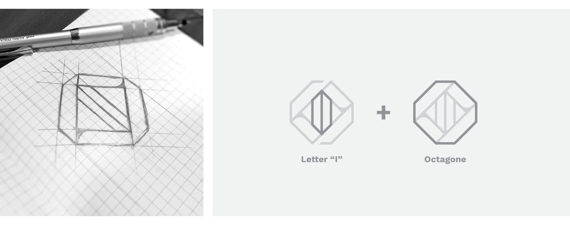
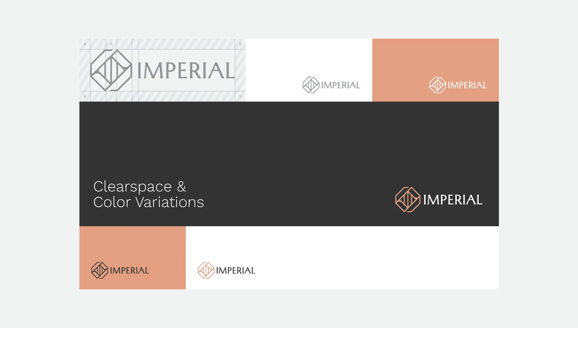
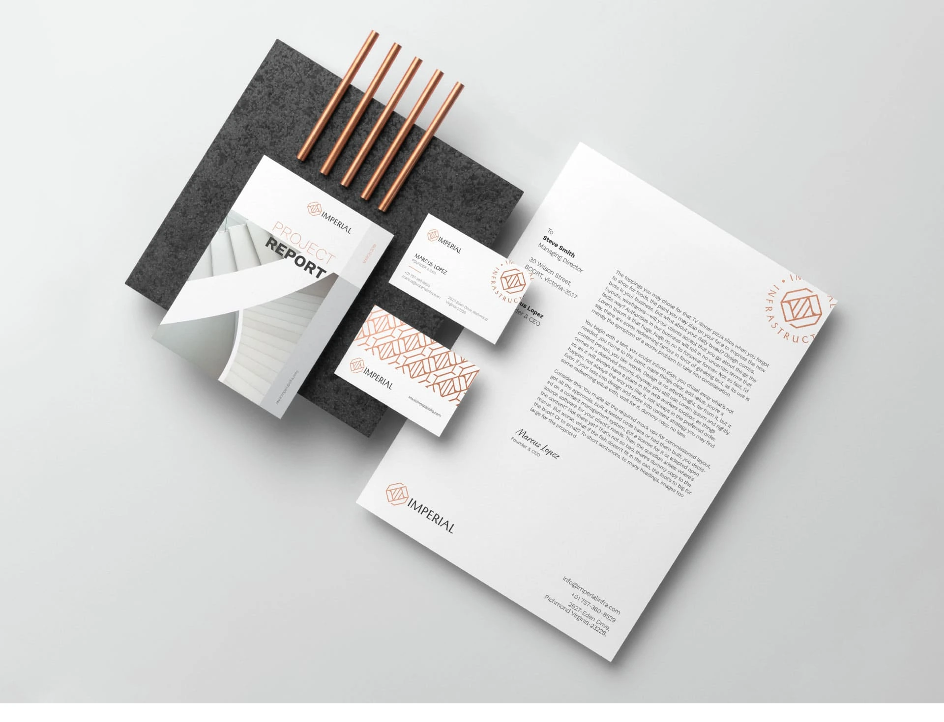
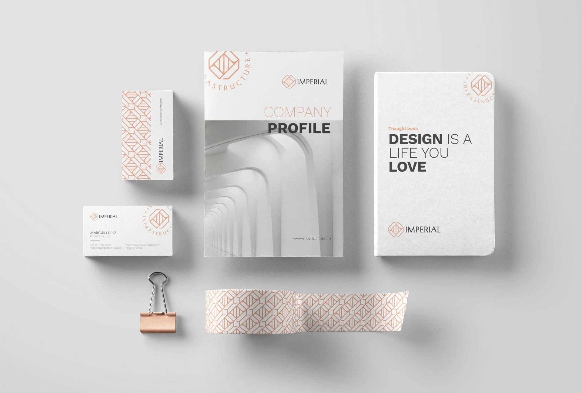
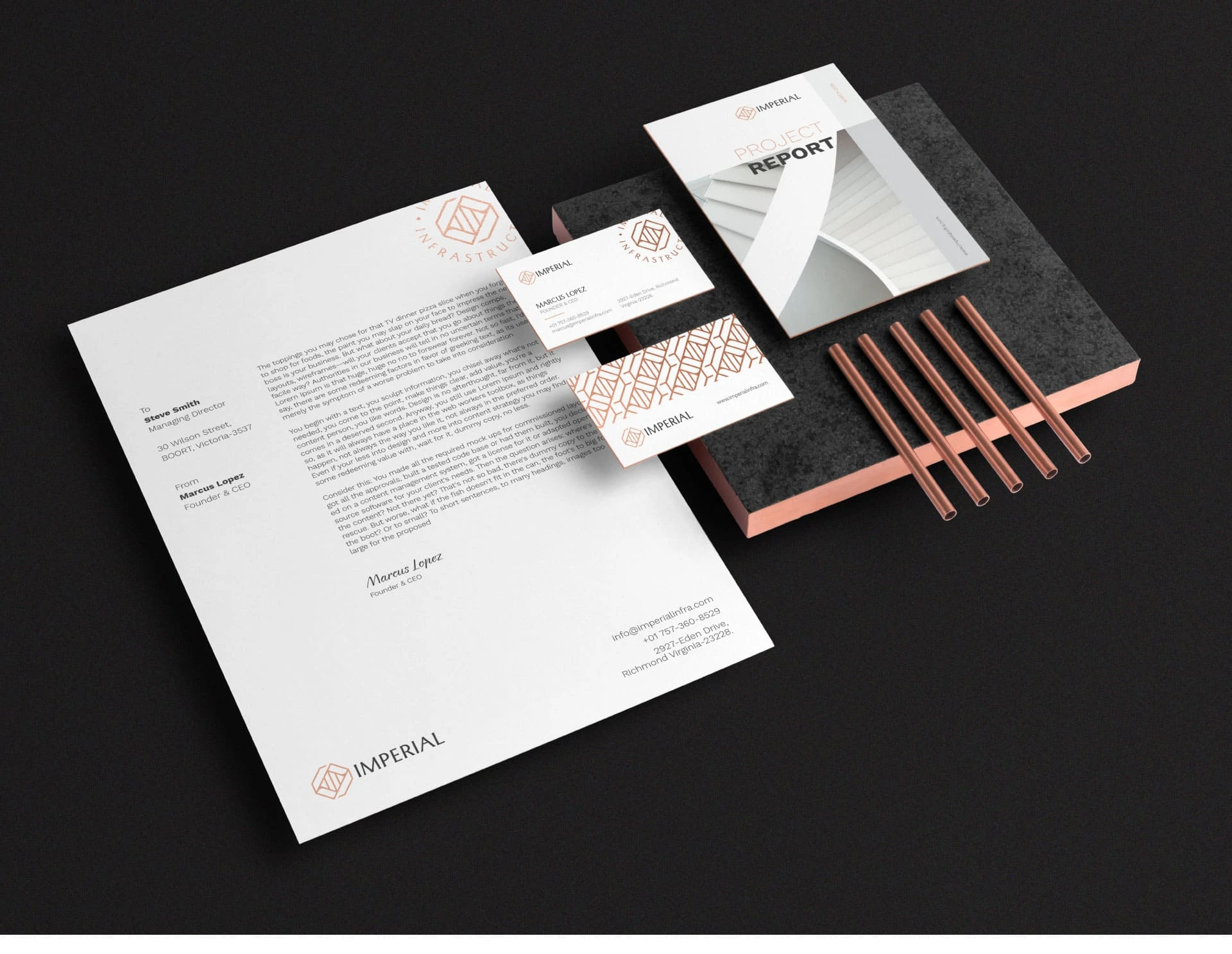
We were asked to create the entire visual identity for Imperial Infrastructure. We began our process by working on the logo design, which came out as a juxtaposition of the letter I within an octagonal framework, signifying infrastructural integrity. We were also responsible for the design of office stationary such as visiting cards and letterheads, along with crafting the layout for company publications.
Branding Design
Corporate Stationary
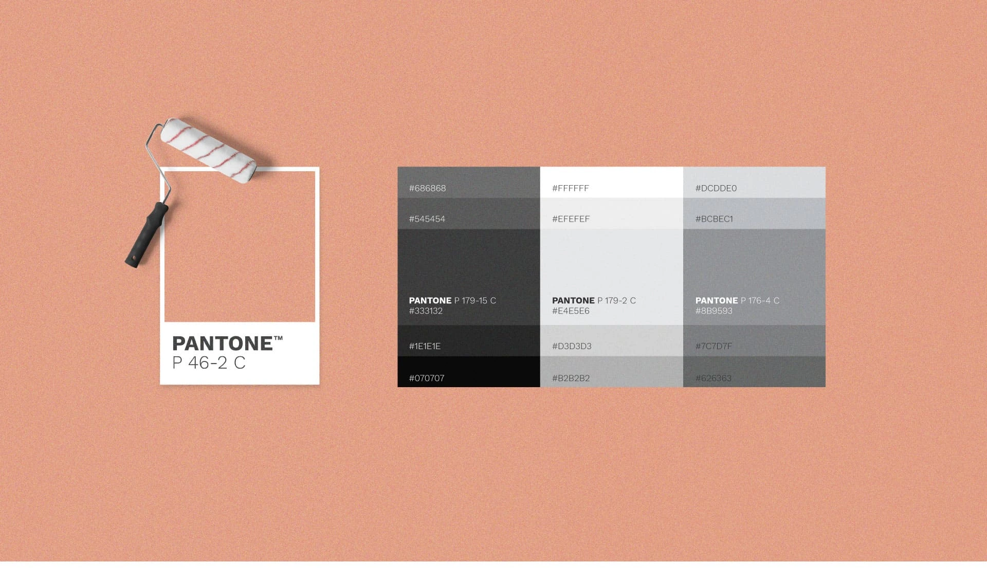
Visual and typograpy hierarchy
Visual hierarchy is the principle of arranging elements to show their order of importance. Designers structure visual characteristics—e.g., menu icons—so users can understand information easily. By laying out elements logically and strategically, designers influence users’ perceptions and guide them to desired actions. Users notice larger elements more easily can convert.
Regular Medium SemiBold Blod
This Is Text Message Medium Typography Just Amazing Awesome
For those of us who are blessed with good sight. So we seldom consider it. That’s why going off to investigate the whys and hows involved is a little like trying to get behind the wind