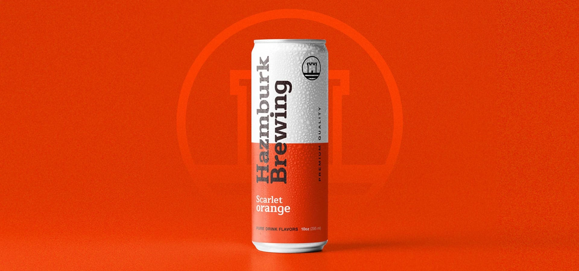
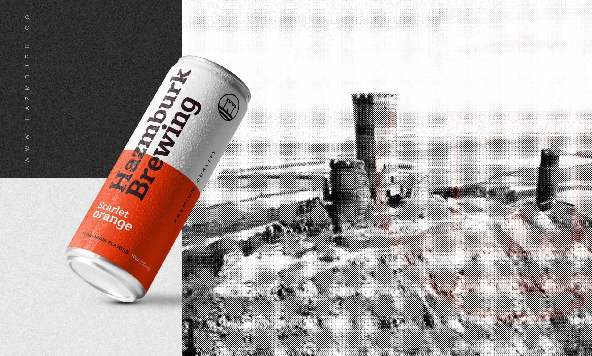
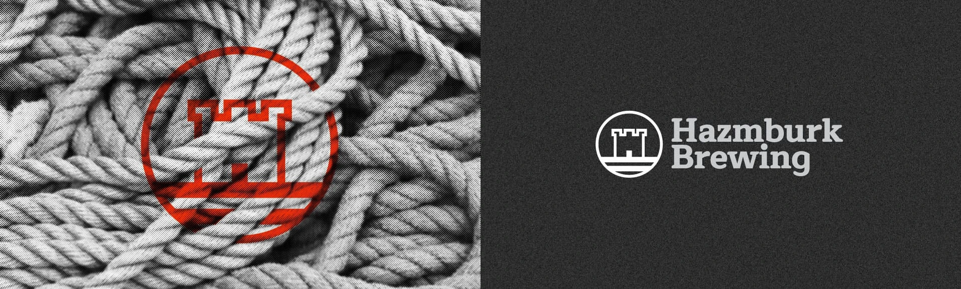
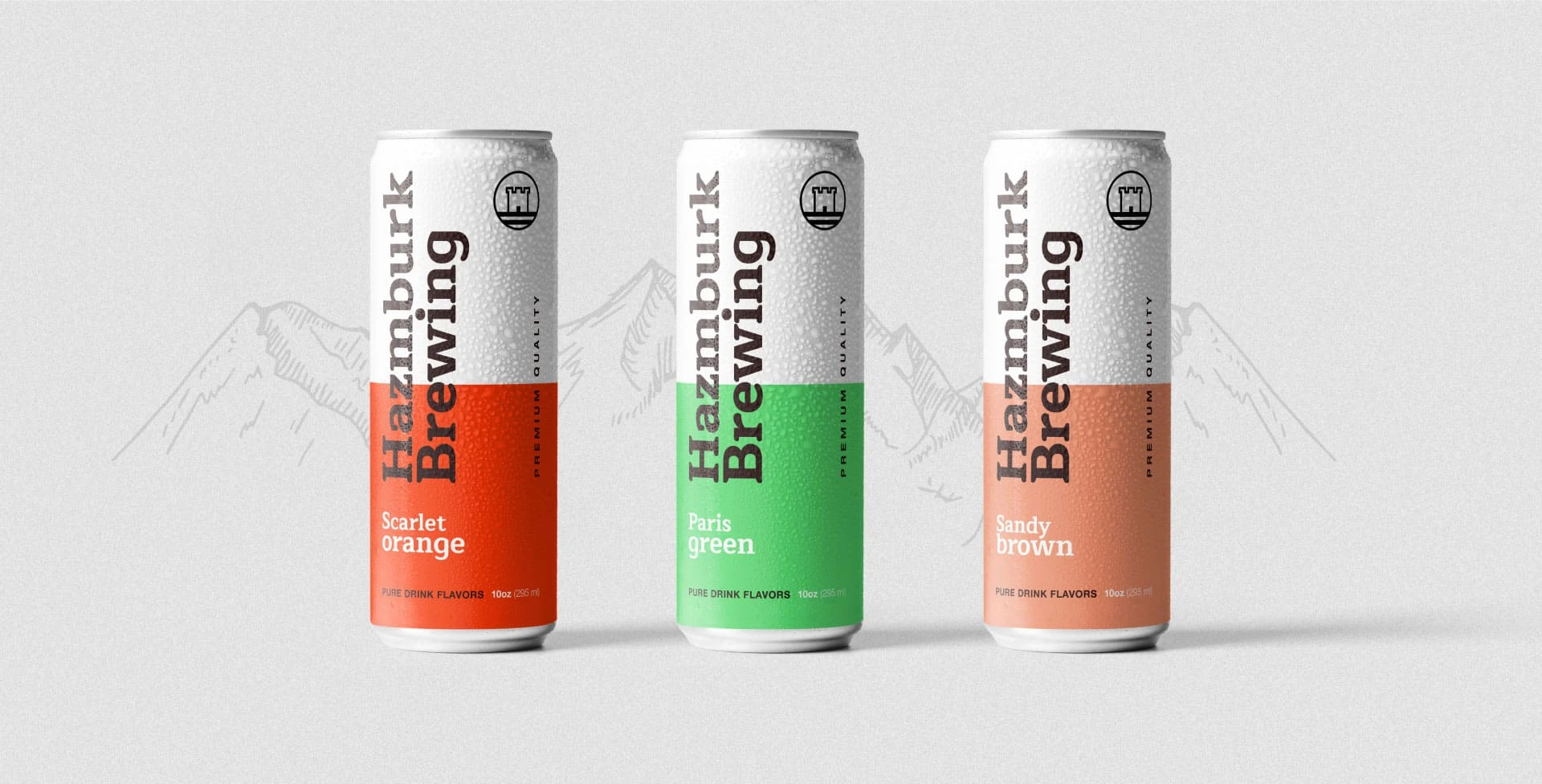
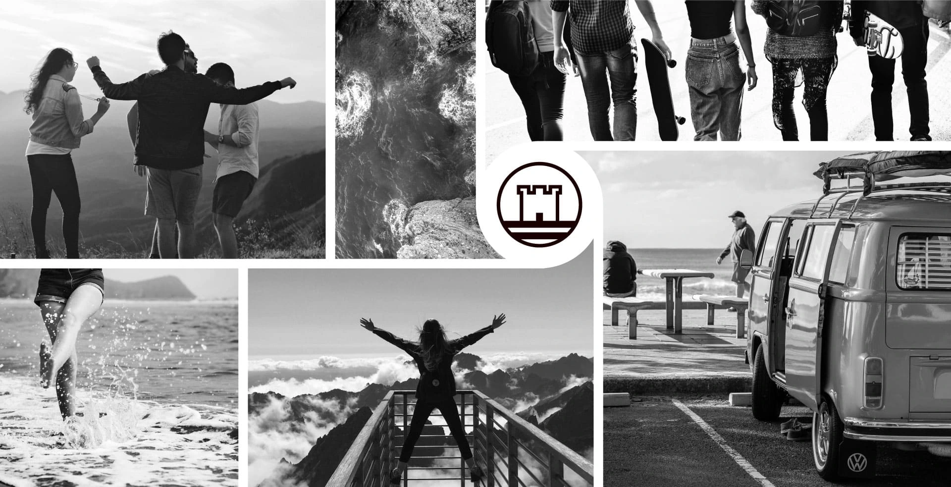
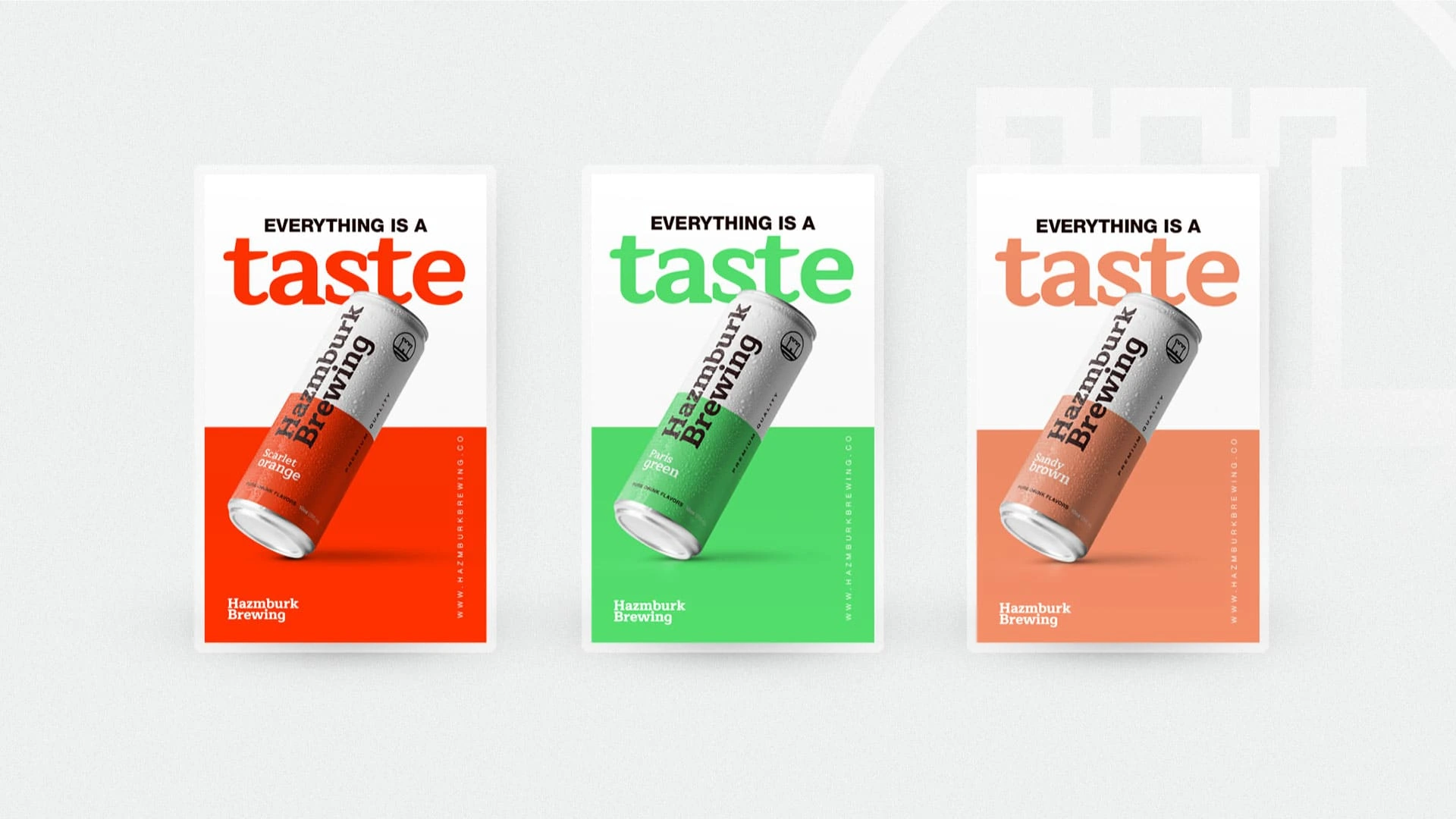
Our work with Hazmburk Brewing involved creating original logo and can designs for their brand. The design process was to be inspired by flavours of nature that matched the tastes of the drink and the target audience. The logo was designed in the shape of an ancient castle tower that signified the majesty and timelessness of the brand. Three colour schemes namely scarlet, green and brown were used to symbolize the three flavors of the drink.
Branding Design
eNewsletter
Labels
Visual and typograpy hierarchy
Visual hierarchy is the principle of arranging elements to show their order of importance. Designers structure visual characteristics—e.g., menu icons—so users can understand information easily. By laying out elements logically and strategically, designers influence users’ perceptions and guide them to desired actions. Users notice larger elements more easily can convert.
Regular Medium SemiBold Blod
This Is Text Message Medium Typography Just Amazing Awesome
For those of us who are blessed with good sight. So we seldom consider it. That’s why going off to investigate the whys and hows involved is a little like trying to get behind the wind