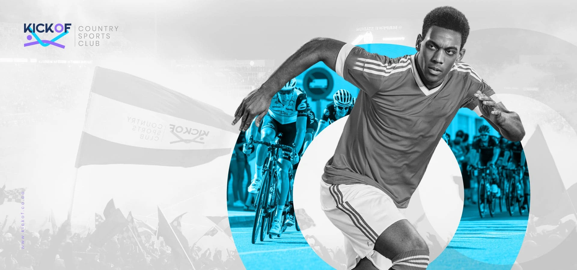
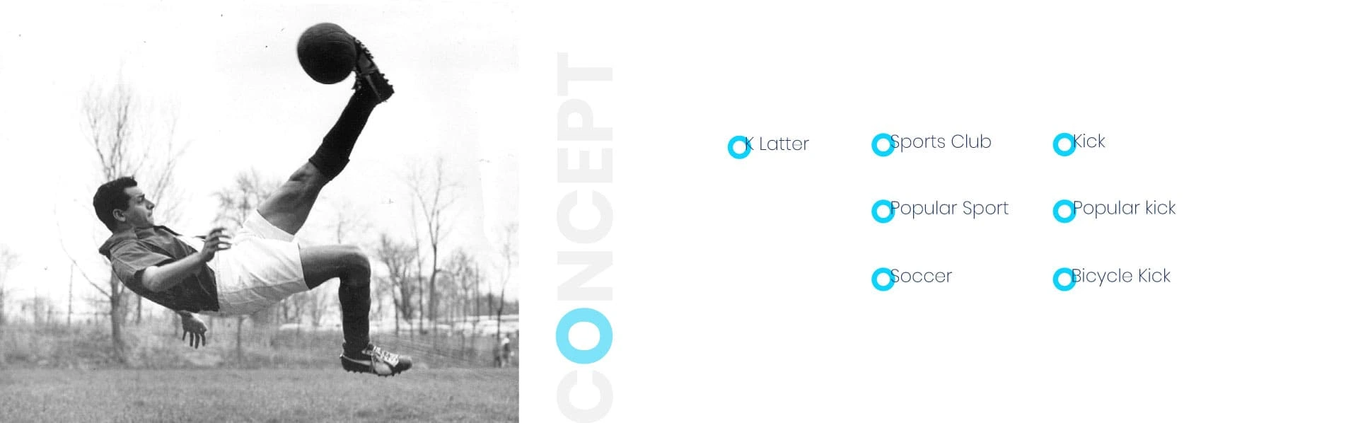
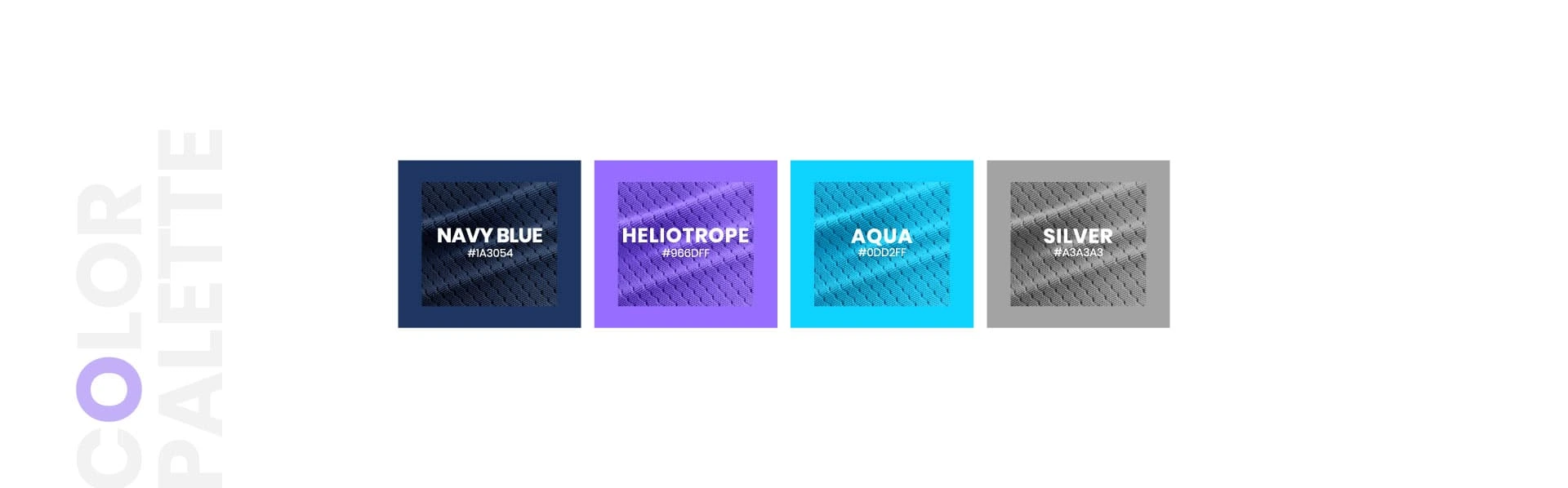
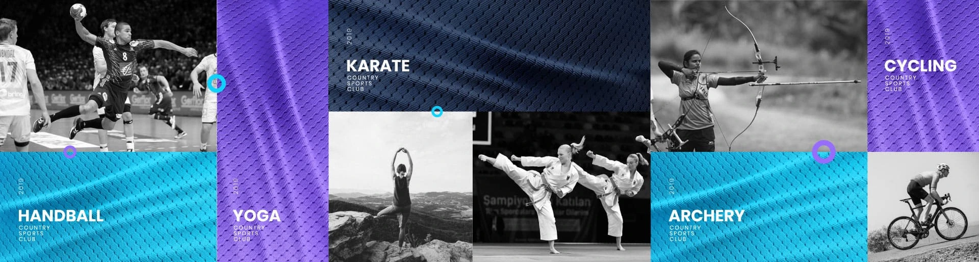
For Kickof Country Sports Club we were responsible for designing the promotional material for the brand’s sporting events. The colour schemes were the prime directive in this case, as they were meant to invoke a sporty feeling. The promotional material represented multiple events such as cycling, archery and handball.
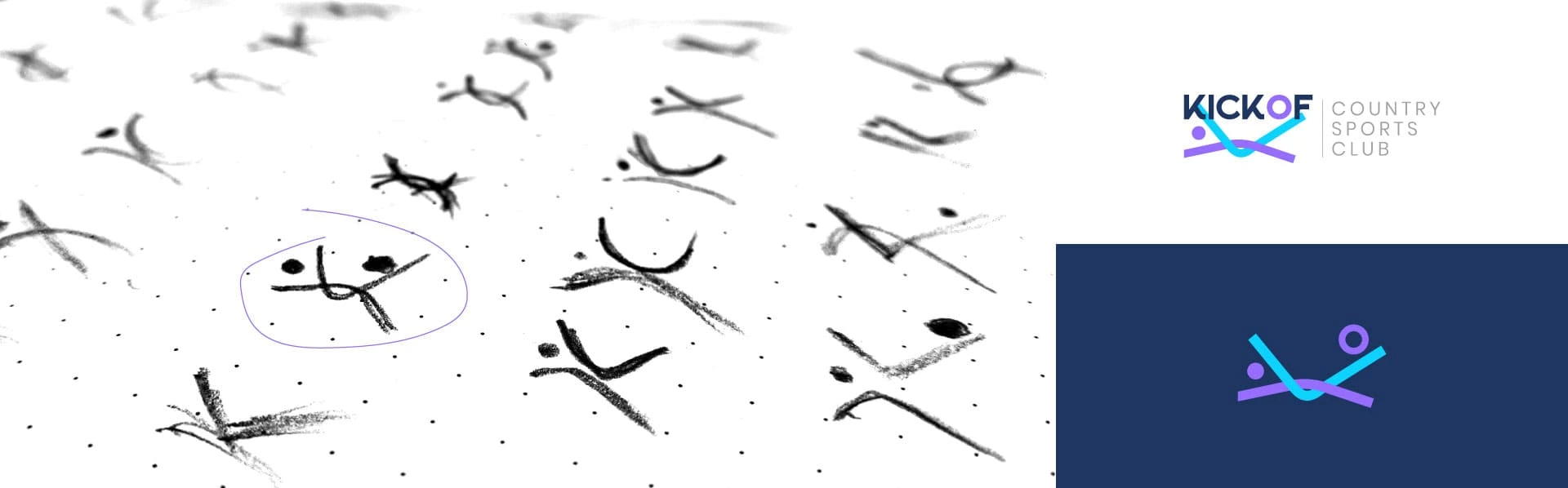
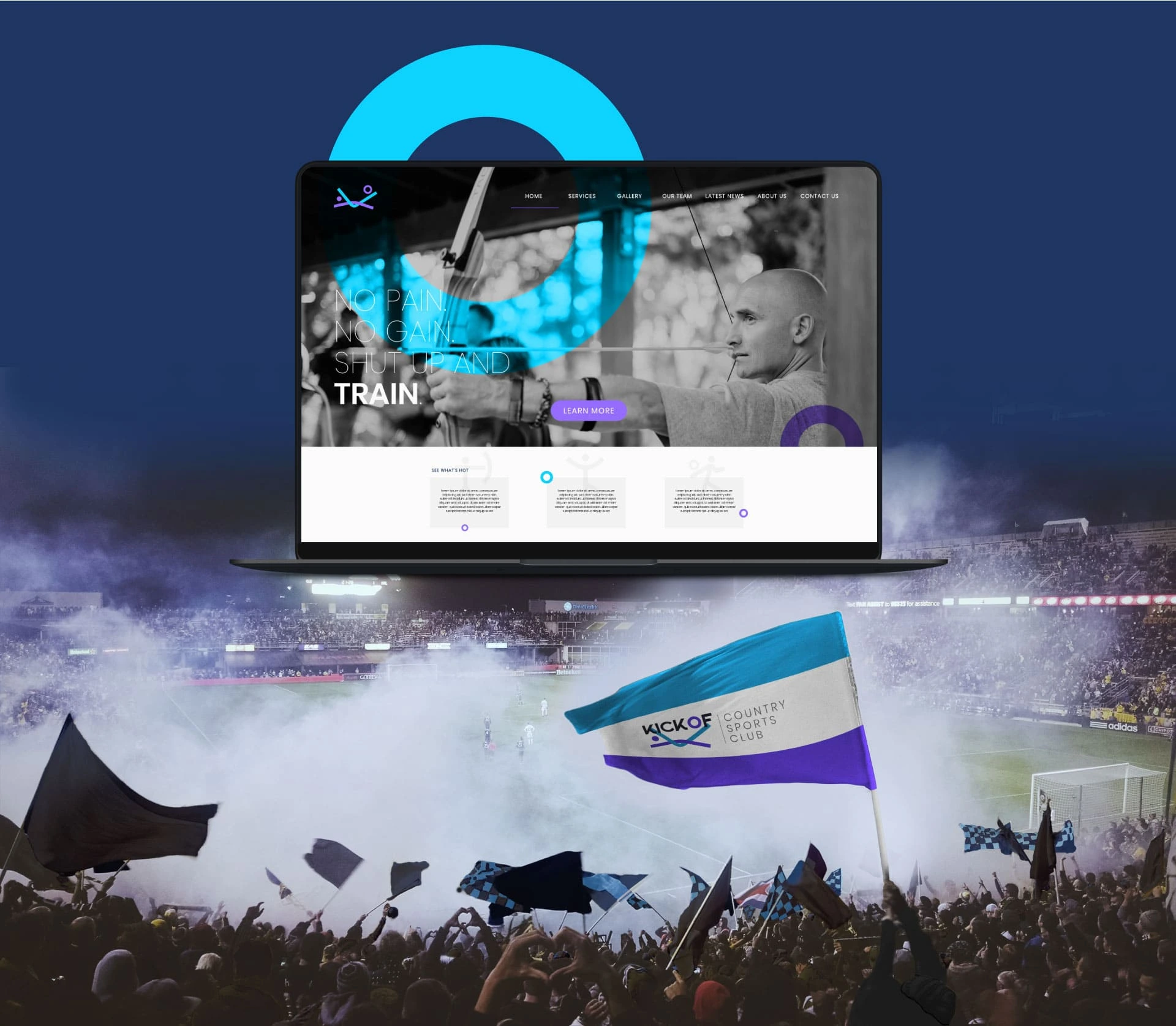
Branding Design
Website Design
Merchandise
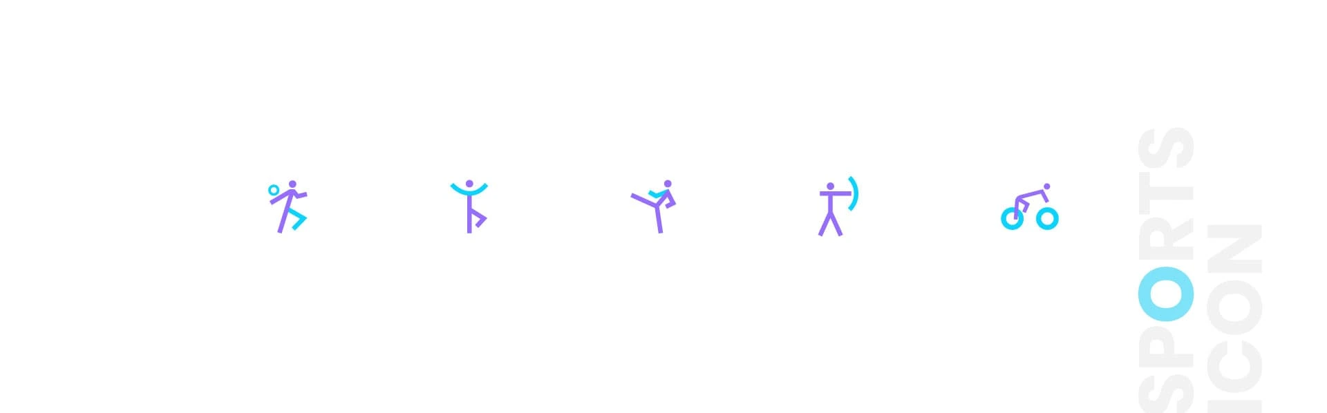
Visual and typograpy hierarchy
Visual hierarchy is the principle of arranging elements to show their order of importance. Designers structure visual characteristics—e.g., menu icons—so users can understand information easily. By laying out elements logically and strategically, designers influence users’ perceptions and guide them to desired actions. Users notice larger elements more easily can convert.
Regular Medium SemiBold Blod
This Is Text Message Medium Typography Just Amazing Awesome
For those of us who are blessed with good sight. So we seldom consider it. That’s why going off to investigate the whys and hows involved is a little like trying to get behind the wind