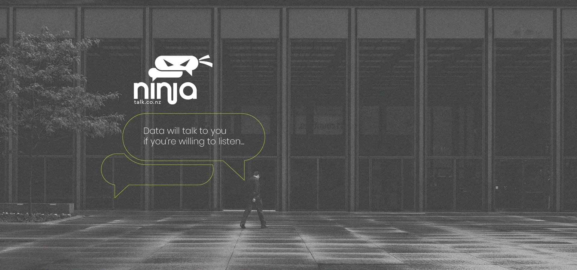
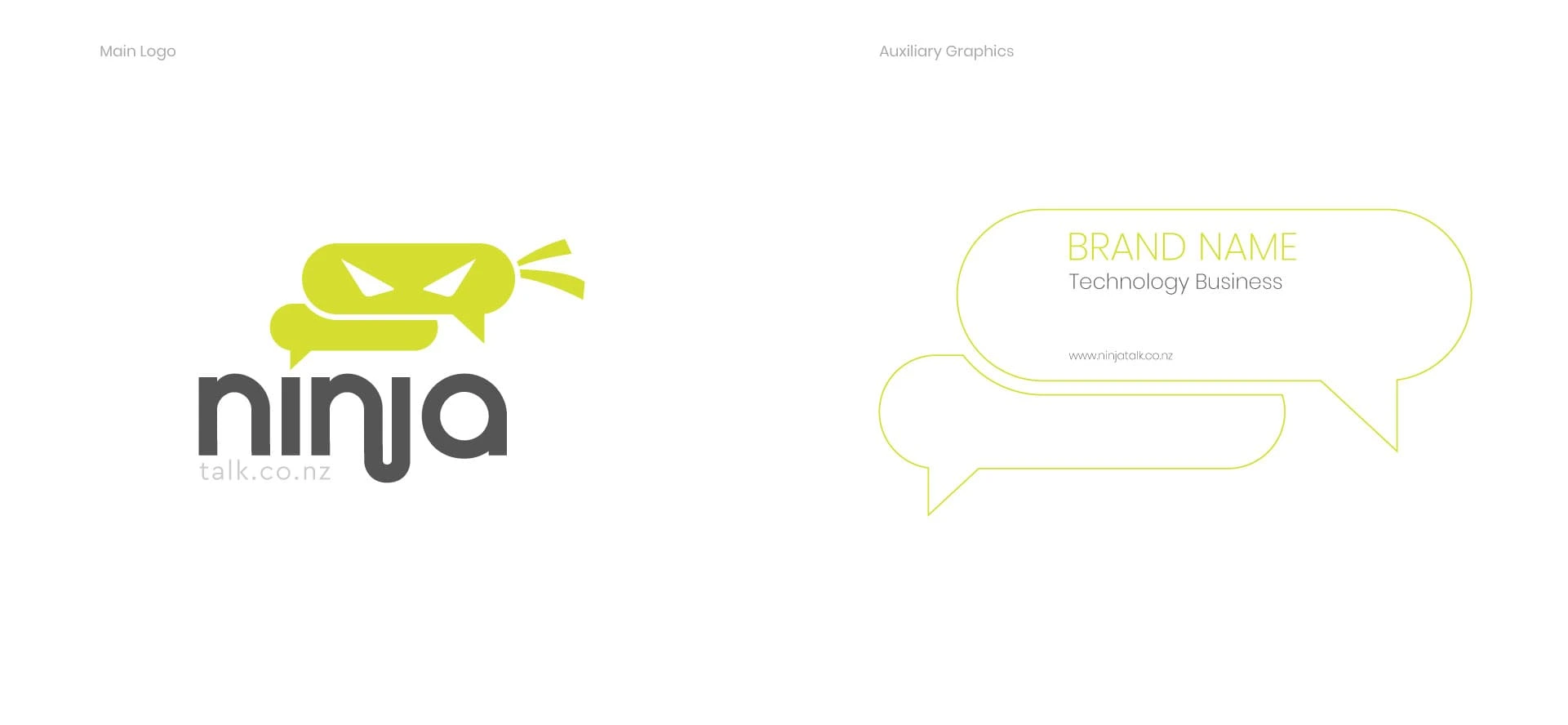
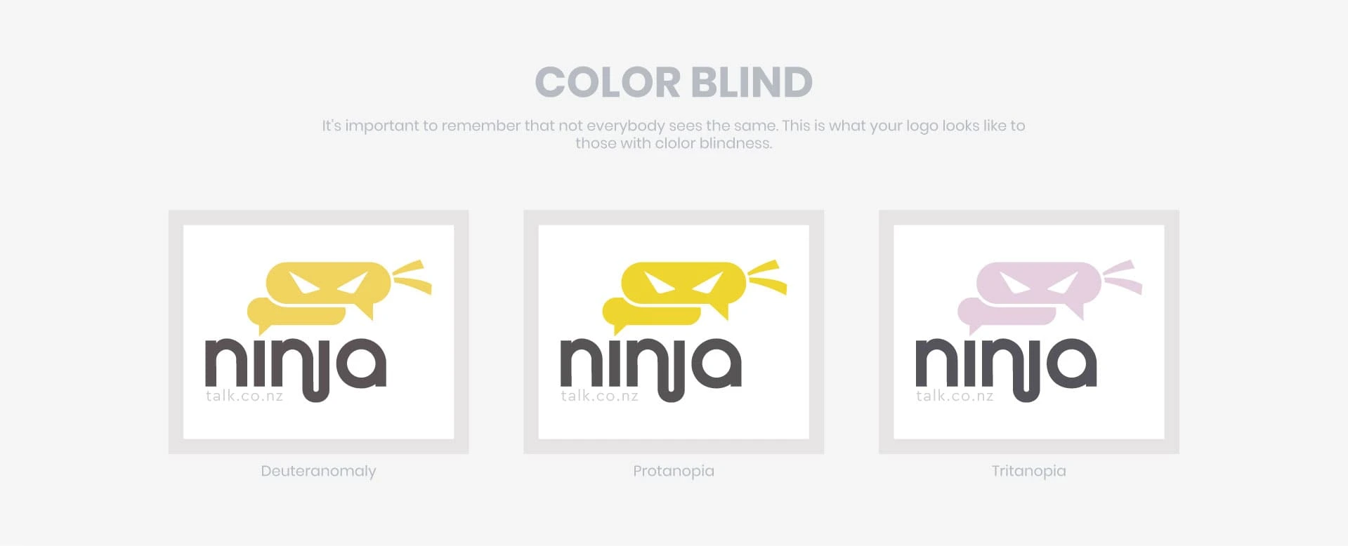
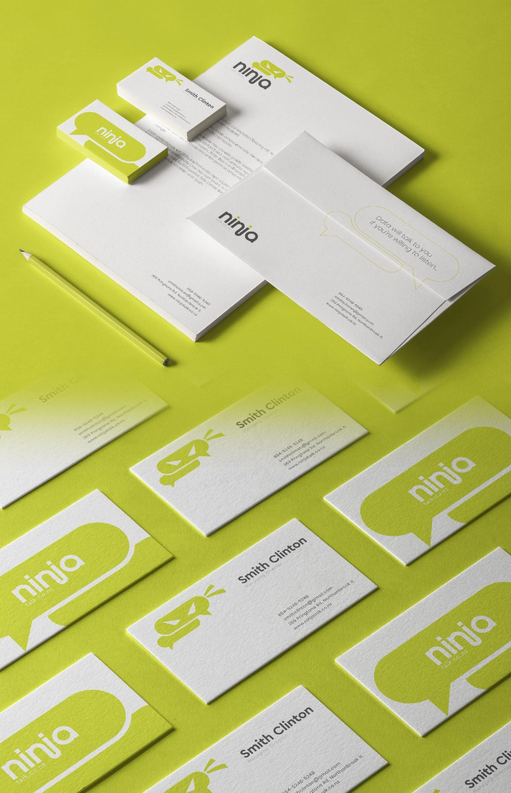
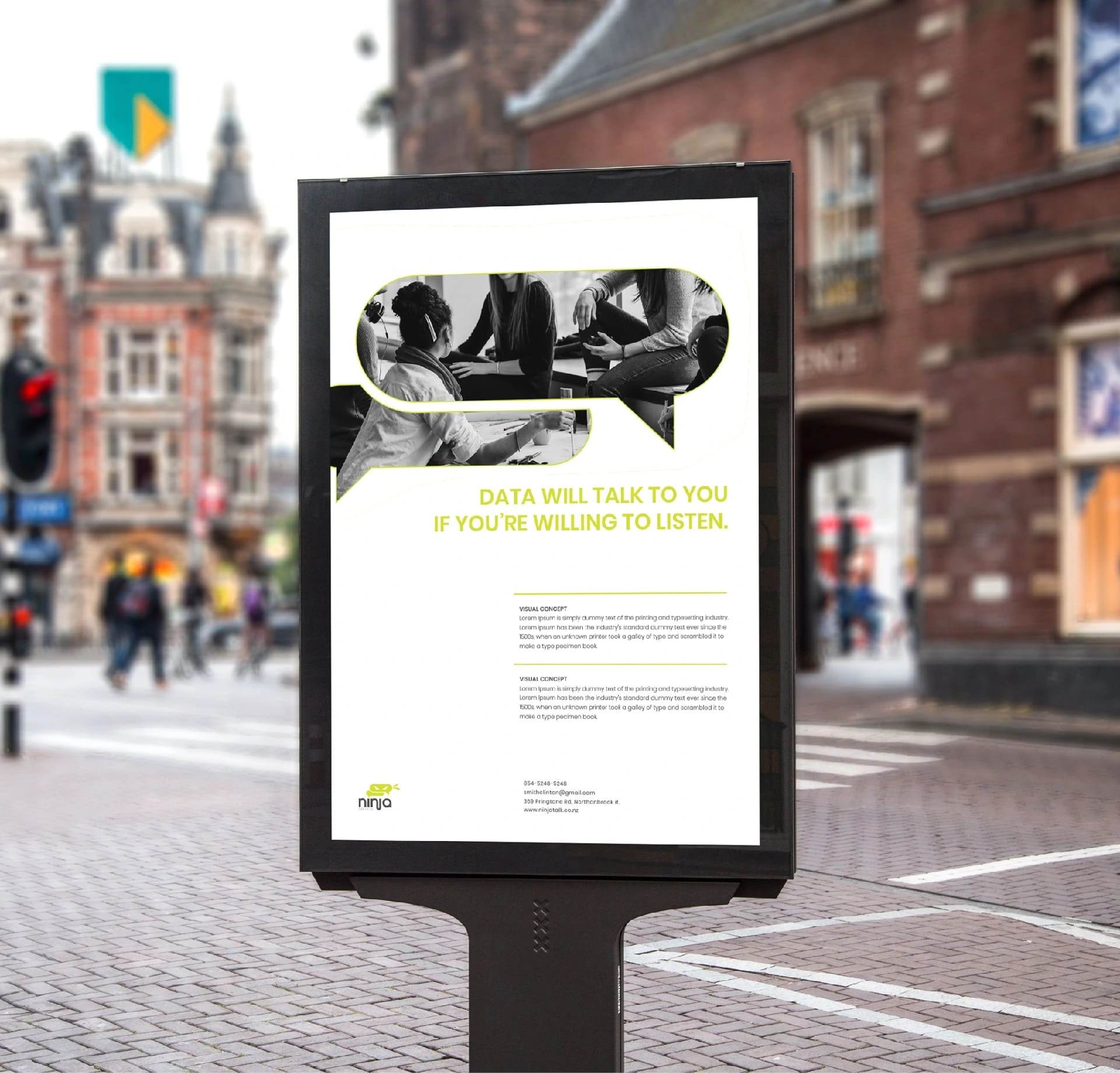
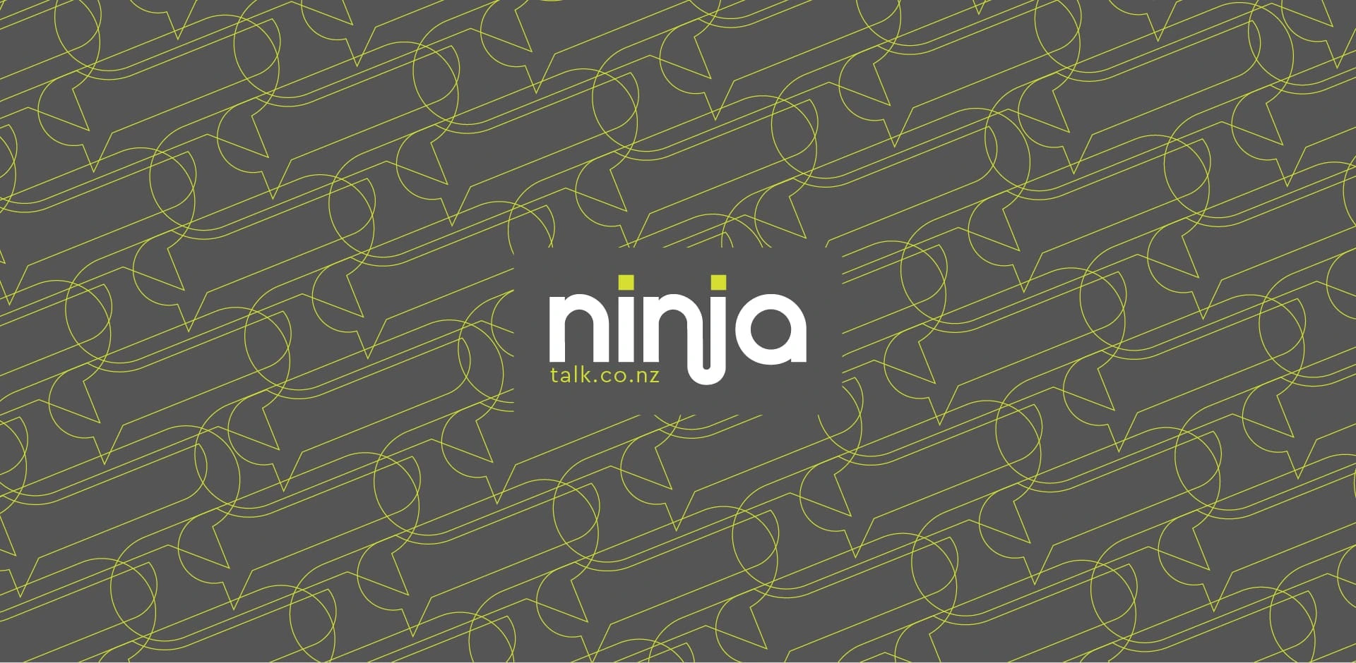
We were asked by Ninjatalk to redesign their visual identity. The first design element we had to handle was the logo, which we re-imagined as ninja masks in the form of speech bubbles, reflective of the brand name. The logo colour schemes were designed keeping different visual abilities in mind. Office stationary colours and designs were also created by us.
Branding Design
Website
Stationary
Visual and typograpy hierarchy
Visual hierarchy is the principle of arranging elements to show their order of importance. Designers structure visual characteristics—e.g., menu icons—so users can understand information easily. By laying out elements logically and strategically, designers influence users’ perceptions and guide them to desired actions. Users notice larger elements more easily can convert.
Regular Medium SemiBold Blod
This Is Text Message Medium Typography Just Amazing Awesome
For those of us who are blessed with good sight. So we seldom consider it. That’s why going off to investigate the whys and hows involved is a little like trying to get behind the wind