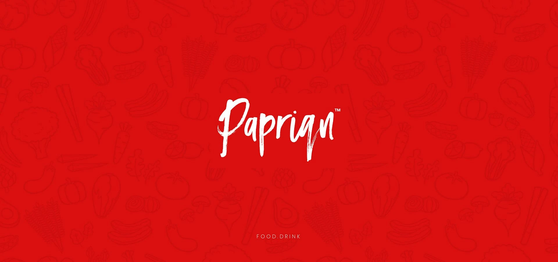
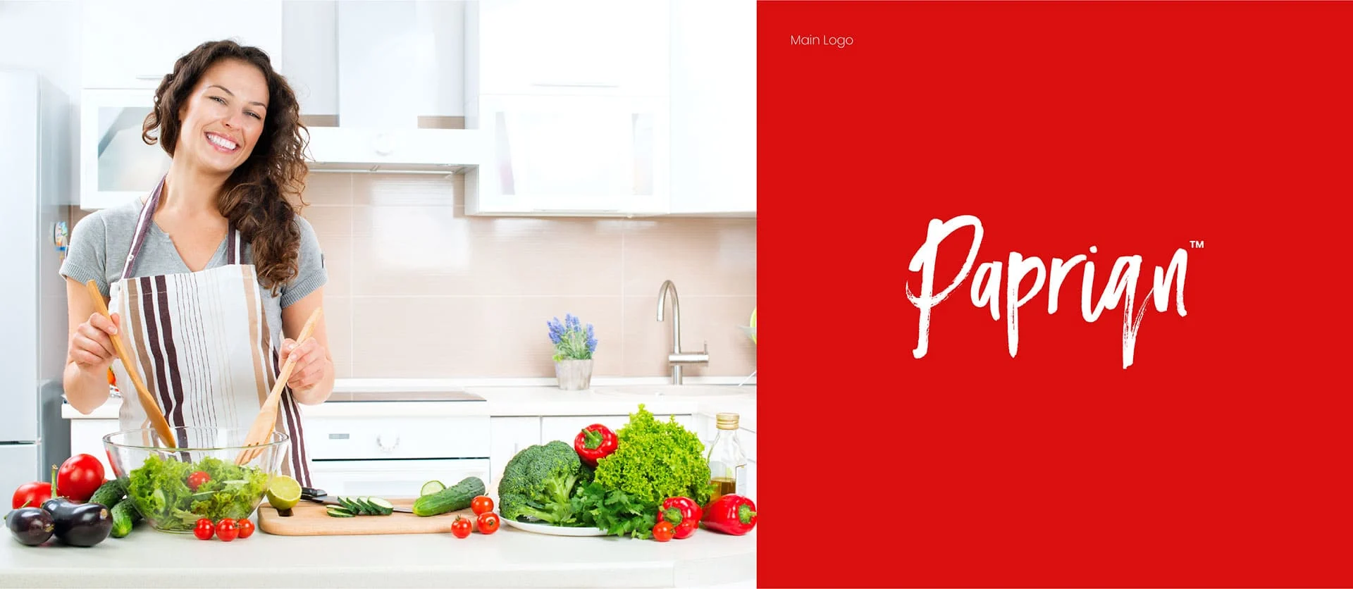
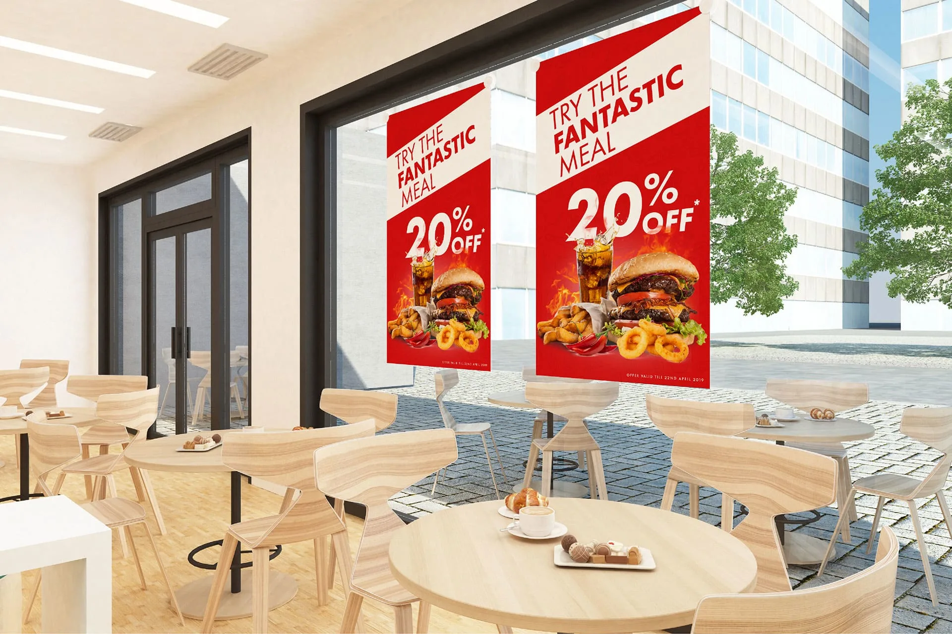
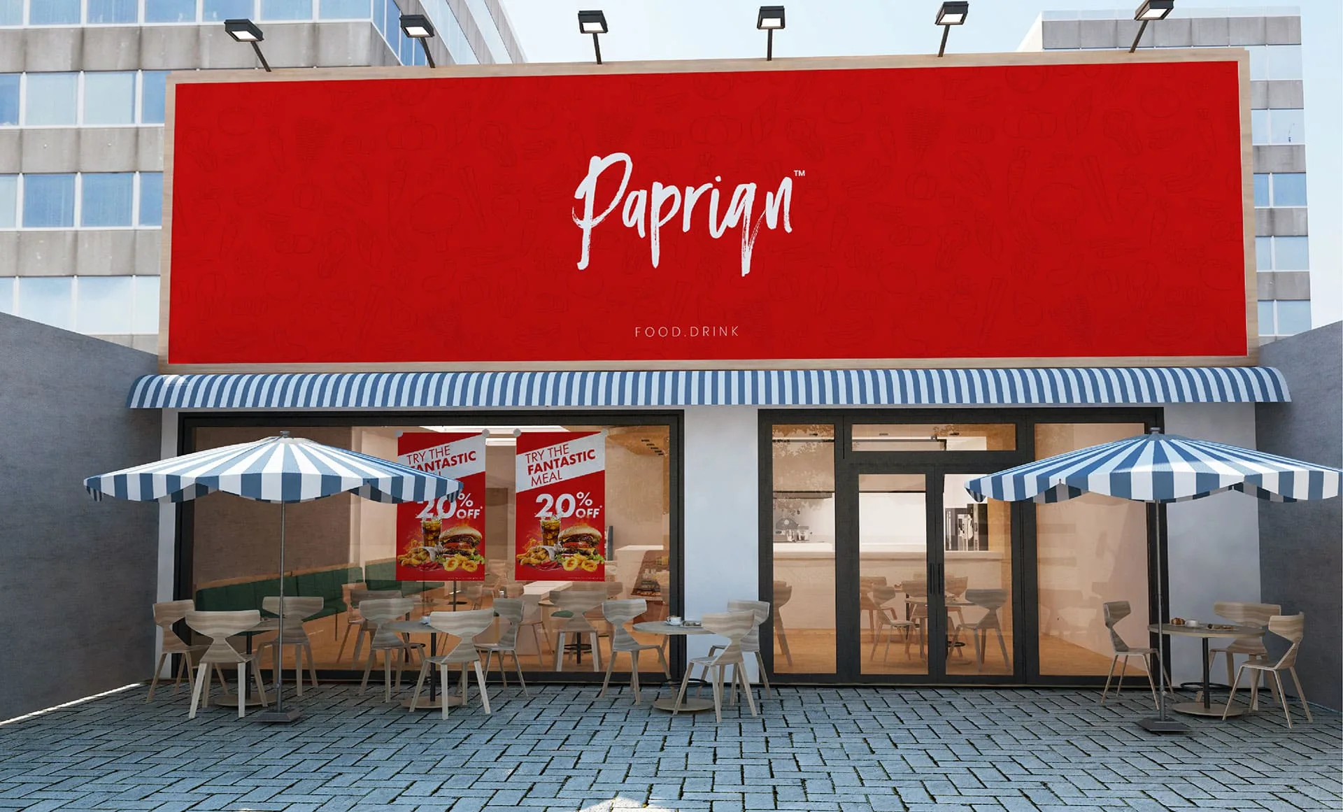
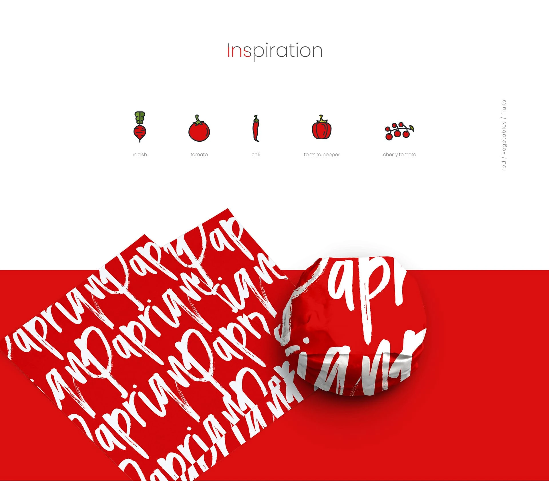
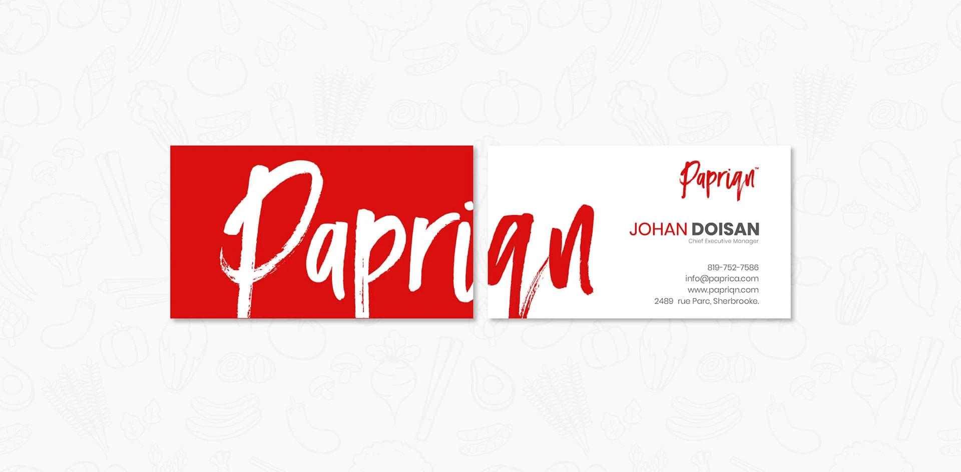
In order to create the brand identity of Papriqn, we took inspiration from red peppers. This was meant to symbolize both the name of the eatery as well as the spicy and tasty menu that was on offer. The logo designs as well as promotional posters were created by us keeping the central theme of exquisite culinary experience in mind.
Branding Design
Menus
Advertisement
Visual and typograpy hierarchy
Visual hierarchy is the principle of arranging elements to show their order of importance. Designers structure visual characteristics—e.g., menu icons—so users can understand information easily. By laying out elements logically and strategically, designers influence users’ perceptions and guide them to desired actions. Users notice larger elements more easily can convert.
Regular Medium SemiBold Blod
This Is Text Message Medium Typography Just Amazing Awesome
For those of us who are blessed with good sight. So we seldom consider it. That’s why going off to investigate the whys and hows involved is a little like trying to get behind the wind